Website Design for Harvestone Group LLC
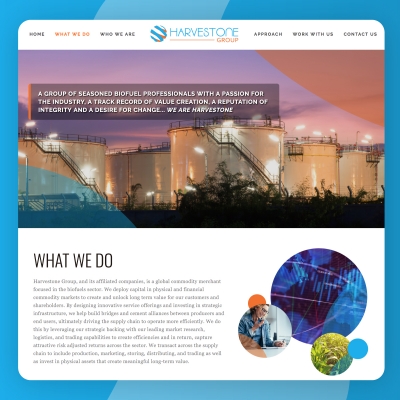
Harvestone Group LLC requested an efficient & personally engaging website designed to help launch their brand in the global market. The design elements on the site are a blend of images illustrating everything from marketing services, merchant trading, to asset optimization.
"Harvestone Group, and its affiliated companies, is a global commodity merchant focused in the biofuels sector. We deploy capital in physical and financial commodity markets to create and unlock long term value for our customers and shareholders."